A Guide to Exposure-Response Plots
Visualizing the relationship between drug exposures and treatment response using R and ggplot.
- Exposure-Response Analyses: Introduction
- Data Needed for Exposure-Response Analyses
- Graphical Assessment of Exposure-Response Relationships
- Additional Resources
Exposure-Response Analyses: Introduction
In the past few decades, exposure-response analyses have become an integral part of the development of new drug products, and have become an important (and expected) component in the justification of dose selection when submitting for regulatory approval. Assessing the relationship between drug exposure and treatment response provides a level of granularity which can't be achieved by only looking at the dose-response relationship. Exposure-response analyses can assist in making critical decisions around a variety of topics including:
-
Optimal Dose for Benefit:Risk:
- Is an efficacy plateau achieved within the range of studied drug exposures?
- At what exposures is a response plateau seen for key efficacy and safety measures?
-
Dosage Form Reformulation/Dose Interval Extension:
- What is the best exposure metric (AUC, Cmax, Ctrough) which correlates with treatment response/adverse events?
- What dose would match those exposures when transitioning to an extended-release formulation?
- Is there an opportunity to extend the dosing interval of the current formulation while still achieving adequate AUC or Ctrough exposures for efficacy while avoiding toxic Cmax exposures?
-
Dose Selection in Subpopulations
- Is the exposure-response relationship different within different subpopulations?
- Are there statistically significant covariate effects with the exposure-response model?
-
Dose-Extrapolation to Pediatric Subjects
- Is the exposure-response relationship in pediatric subjects and adults similar?
- What pediatric dose would result in similar exposures as those studied extensively in adult subjects?
Data Needed for Exposure-Response Analyses
-
Drug-exposure metrics (AUC, Cavg, Cmax, and/or Ctrough) for individual subjects
- Drug exposure metrics can be obtained from population PK analysis or NCA (if densely sampled PK is available)
-
Treatment response variable(s)
- These should be aligned with the primary and key secondary clinical endpoints of the trial.
-
Covariates
- Patient demographics and other key patient characteristics
Graphical Assessment of Exposure-Response Relationships
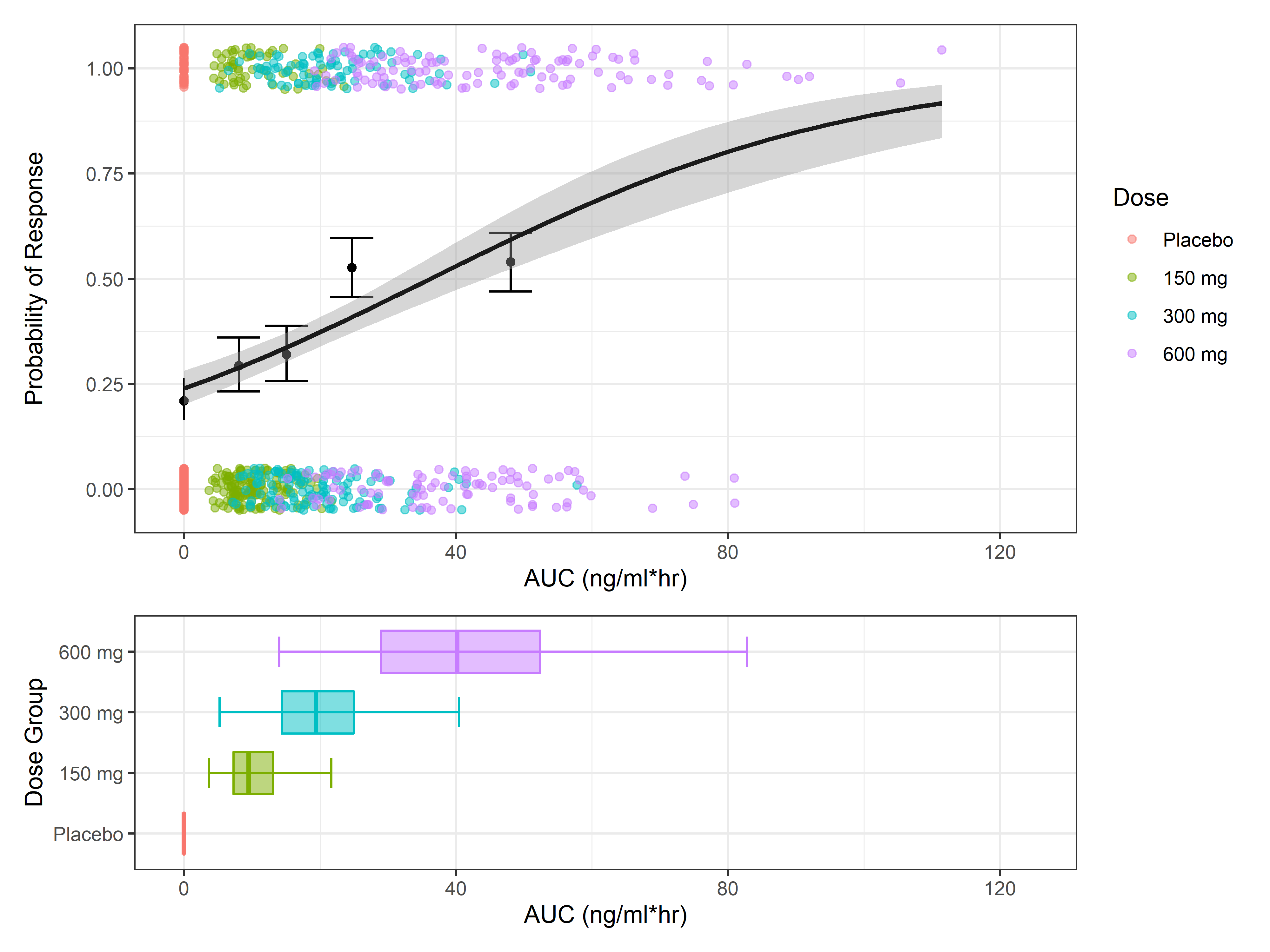
This post will focus on strategies and examples for graphically assessing exposure-response relationships. The code used in this example was designed to be general and can be adapted to be used for other datasets.
In this post we will (1) simulate dummy exposure-response data, (2) summarize treatment response by exposure quartile, and (3) visualize the exposure-response relationship using two common E-R plots - bar plot of response variable by exposure quartile, and regression line of relationship between exposure metric and treatment response.
Load Libraries
Simulate Exposure Response Data
Exposures (AUC) were simulated from a log-normal distribution at 3 active dose levels and a placebo group. 200 subjects were included in each arm. The response variable is a binary response, with the probability of achieving response correlated with AUC.
| ID | Dose | AUC24 | z | pr | resp |
|---|---|---|---|---|---|
| 1 | Placebo | 0 | 0 | 0.2 | 0 |
| 2 | Placebo | 0 | 0 | 0.2 | 0 |
| 3 | Placebo | 0 | 0 | 0.2 | 0 |
| 4 | Placebo | 0 | 0 | 0.2 | 0 |
| 5 | Placebo | 0 | 0 | 0.2 | 0 |
| 6 | Placebo | 0 | 0 | 0.2 | 1 |
| 7 | Placebo | 0 | 0 | 0.2 | 0 |
| 8 | Placebo | 0 | 0 | 0.2 | 0 |
| 9 | Placebo | 0 | 0 | 0.2 | 0 |
| 10 | Placebo | 0 | 0 | 0.2 | 0 |
Choosing the Number of Quantiles
The number of quantiles that you choose depends on the size of your dataset, the spread of exposures within the dataset, and the variability associated with the response. Larger datasets with small variability in response support the use of a greater number of quantiles and vice-versa. Generally, four quantiles (quartiles) is a good balance to provide enough exposure bins to elucidate the E-R relationship while not too many that there are large fluctuations between bins due to random variability of treatment response. However, it is also a good idea to test different quantiles (usually between 2-10) to see when the randomness in quantile bins begins to outweigh the extra granularity of using more bins.
For this code example, 4 quantiles are used, although it is set up in a way that the number of quantiles can be updated and rerun to produce figures with different numbers of quantiles.
Partitioning the exposures into quantiles and summarize
We will use a handy function called cut in base R to bin the individual exposures into their associated exposure bin.
Plot Exposure-Response Quantile Plot
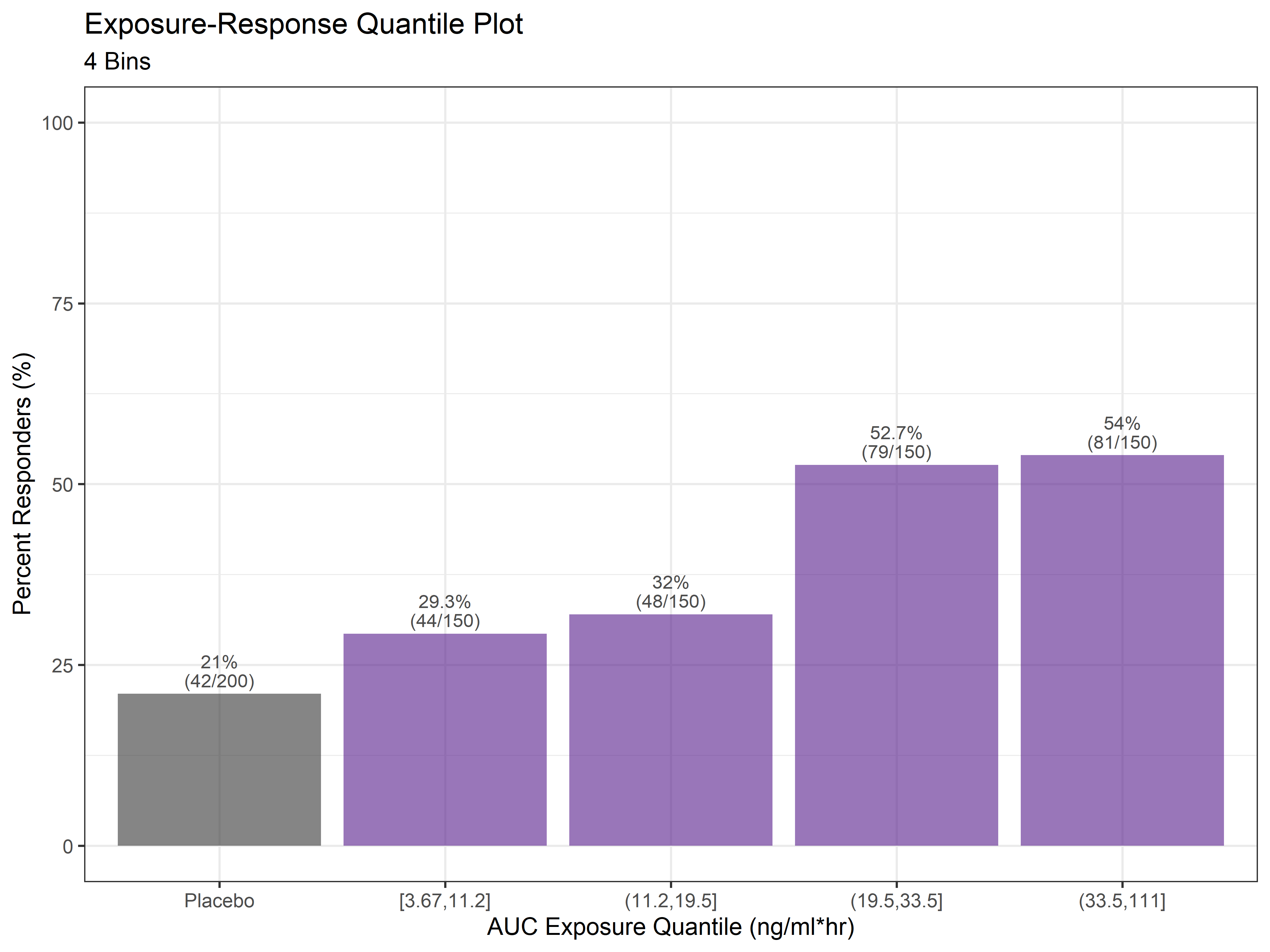
Plot Exposure-Response Quantile Plot
That's all there is to it. For any given exposure-response analysis, there will be dozens of plots such as the ones above exploring different exposure metrics, different clinical efficacy endpoints and adverse events, and different numbers of quantiles. The code in this example can be updated or even made into a function to loop through different inputs of interest.
Additional Resources
xGx R Package: An R package for exploratory graphical analyses with some functions geared towards E-R visualizations.
Establishing Good Practices for Exposure–Response Analysis of Clinical Endpoints in Drug Development: Paper with more details and background on Exposure-Response analyses. RV Overgaard, SH Ingwersen, and CW Tornøe.