Strategies for Visualizing Hysteresis in PK/PD Data
Visualizing hysteresis using ggplot.
What is hysteresis ?
Hysteresis in pharmacokinetic/pharmacodynamic relationships is a phenomenon arising when there is a time dependency on the relationship between drug concentrations and measured response. Hysteresis can be caused by a multitude of different reasons, most typically manifesting as either a delay between measured drug concentrations and down stream pharmacodynamic responses or a wearing off (e.g. tolerance) of drug effect over time. This results in different pharmacodynamic responses at equivalent drug concentrations depending on when in time the variables were measured.
Identifying Hysteresis in Your Data
To identify hysteresis in your PK/PD dataset, start by generating a plot of time-matched concentration vs. response variables. The points in the plot should be connected in the sequence they were measured (i.e. sorted by time). To create this plot in ggplot, we can use the function geom_path instead of the more commonly used geom_line. The main difference between the two is that geom_path will connect the points in the order in which they appear in the dataset, while geom_line will connect them from left to right. This also means that your data needs to be sorted by the time variable for the plot to display correctly.
Generate the PKPD data
We're going to use mrgsolve to generate some PKPD data from an indirect response model (specifically inhibition of production).
Simulating the data
Take a peek at the dataset structure
| time | CP | RESP | ID | dose |
|---|---|---|---|---|
| 0 | 0.0000000 | 100.00000 | 1 | 25 |
| 1 | 0.1120661 | 99.72945 | 1 | 25 |
| 2 | 0.2021932 | 99.05366 | 1 | 25 |
| 3 | 0.2751672 | 98.12278 | 1 | 25 |
| 4 | 0.3346067 | 97.03772 | 1 | 25 |
| 6 | 0.4232411 | 94.66119 | 1 | 25 |
| 8 | 0.4832927 | 92.26292 | 1 | 25 |
| 10 | 0.5239166 | 90.00781 | 1 | 25 |
| 12 | 0.5508347 | 87.97229 | 1 | 25 |
| 14 | 0.5677730 | 86.18569 | 1 | 25 |
Plot the data
Let's plot concentration vs response to visualize the hysteresis.
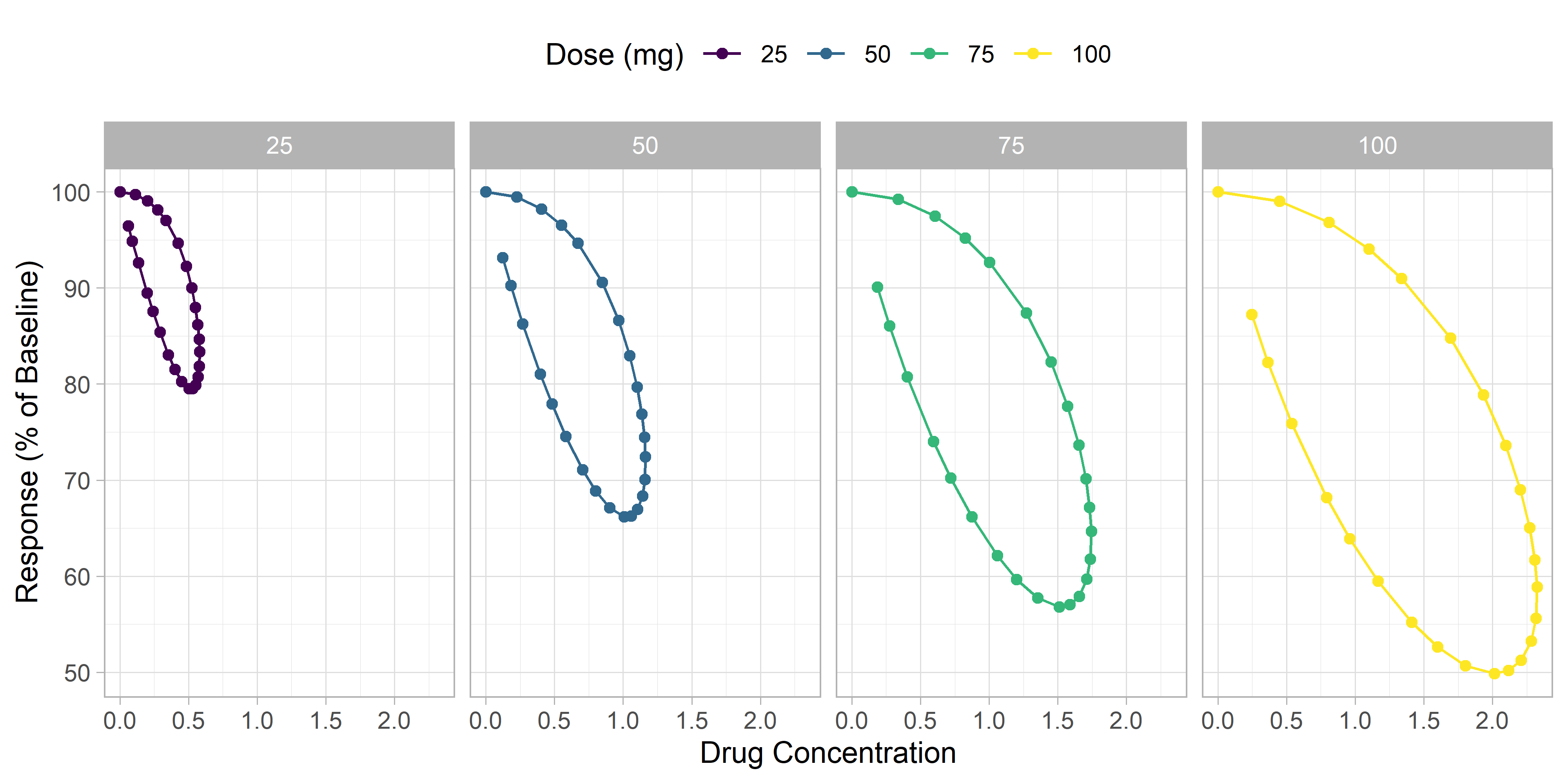
We can see a clear hysteresis, although it is difficult to tell in which direction the loop goes. When looking at your observed data, it is important to clearly visualize the direction of the hysteresis loop, as it can give you insights into what types of PK/PD models may be appropriate to use. A loop that shows more pharmacodynamic effect at later timepoints (at similar concentrations) suggests a delay in drug effect. A loop that shows less effect at later timepoints suggests a wearing off of drug effect over time.
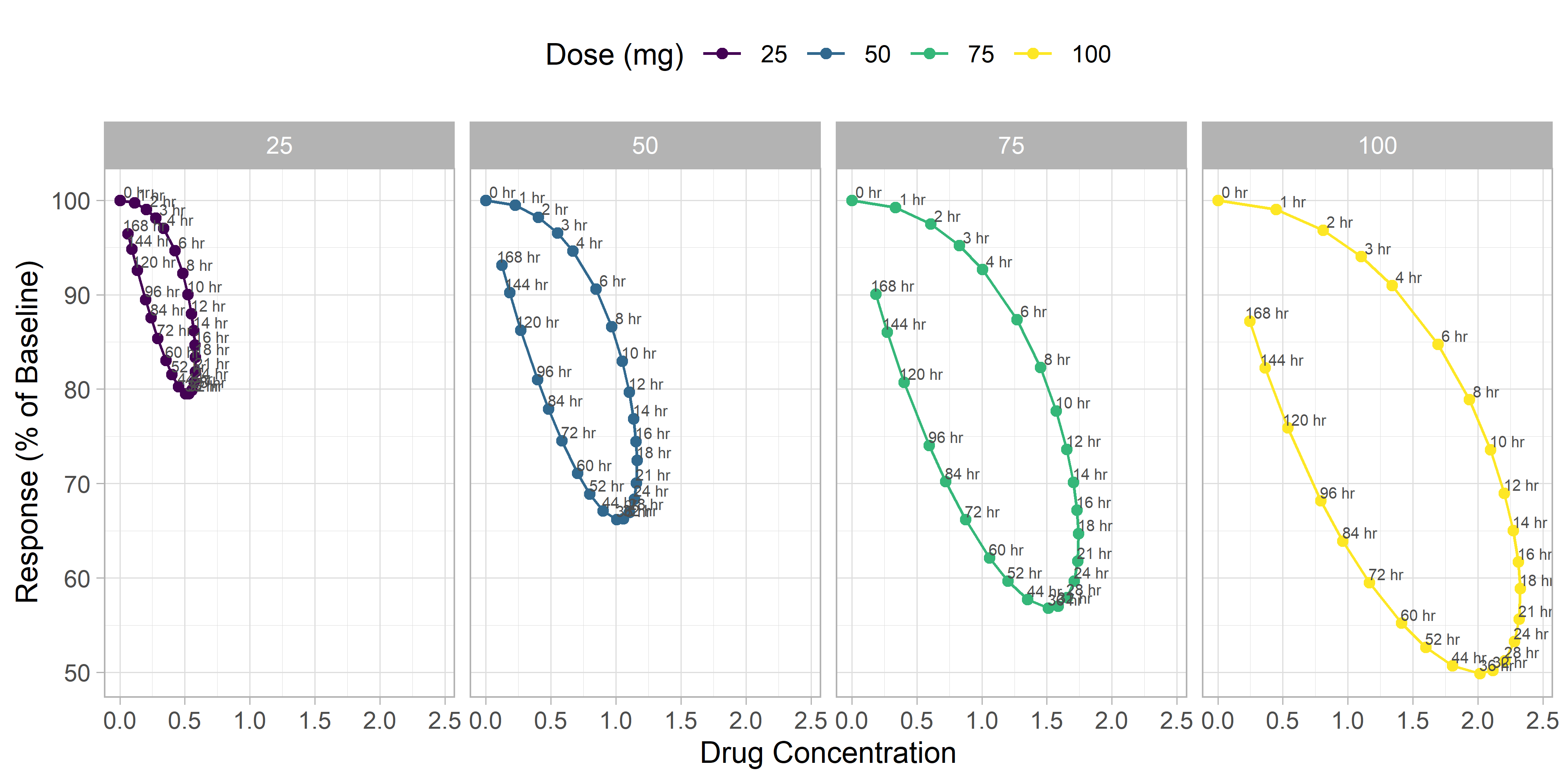
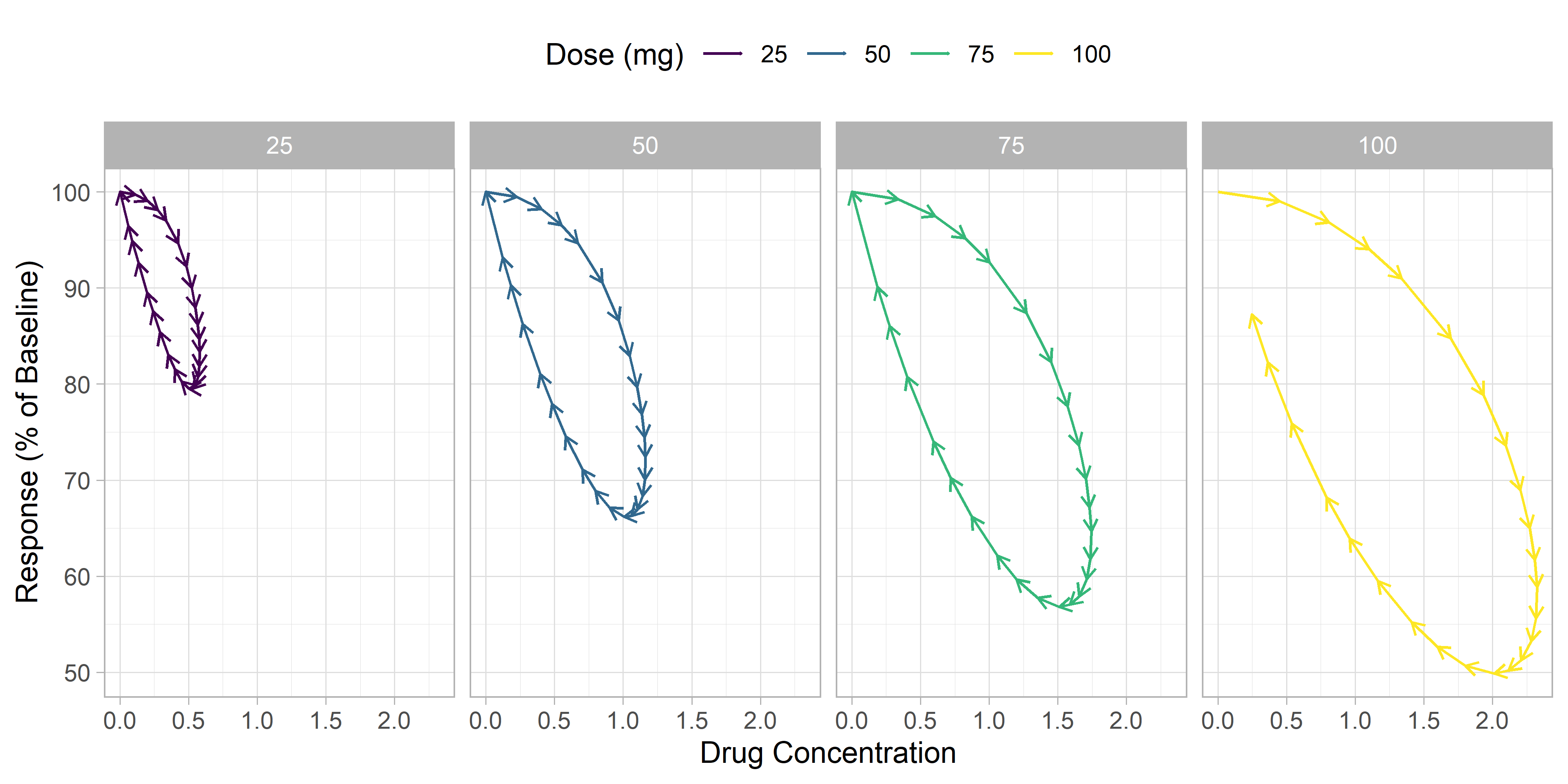
We'll be using two strategies to illustrate which direction the hysteresis loop is going. The first will be to add a time label to each point and the second will be to add arrows to the plot in the direction of the loop.
Adding time labels
Adding arrows
To add arrows, we'll use geom_segment with an arrow segment end. To use geom_segment, we'll need to define a segment end in the dataset, where the end of the segment for each point will be the x and y variables of the next timepoint. The lead() function from dplyr can help us with this.
Next, we'll use geom_segment to create the plot we want.
Using animation to visualize the hysteresis
In addition to the static plots created earlier, animation can also be a useful strategy for visualizing hysteresis data. We'll continue to plot a 2-dimension plot of concentration vs. response, except now we'll incorporate time as the third dimension represented by frames of the animation. To create this figure we'll use the gganimate package.
Have another way you like to visualize hysteresis? Let us know in the comments below.